Triple Your Sales by Making 4 Simple Website Tweaks
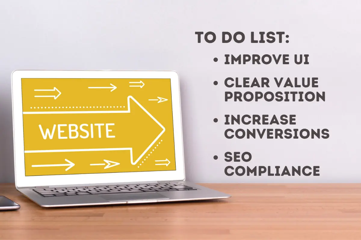
Your business has a website, but unless it’s delivering enough leads, it’s not useful. Use these conversion rate optimization (CRO) tactics and triple your sales by making a few simple website tweaks.
Running your business is one thing, but making it generate enough revenue to achieve your goals can sometimes be a challenge. That’s why you have a website, but unless it’s delivering enough leads, it’s not useful. Use these conversion rate optimization (CRO) tactics and triple your sales by making a few simple website tweaks.
Join the conversation on LinkedIn’s article titled “Make 4 Simple Website Tweaks To Triple Your Sales“
Tweak #1: Improve Your User Interface
A welcoming, intuitive user interface (UI) is super-important when it comes to providing a pleasant experience for your website visitors. Some of the critical characteristics of a successful UI are:
- Clarity: If people can’t figure out how your website works or where to go for the information they need, they’ll leave. Make sure your site displays clear, concise content, scannable text that’s easy to read, and lots of high-quality images.
- Responsiveness: Since mobile users account for 54.8% of global web traffic, according to Statista, it’s crucial that your website responds well to being viewed on any screen. And since Google now penalizes sites that aren’t responsive, this is the single most valuable way to improve your site’s usability.
- Speed: Research shows that even a one-second delay in a website’s loading speed can lead to lower revenue and traffic. If your website doesn’t load in 2 seconds or less, take steps to optimize it until it passes the Google and GTMetrix speed tests.
- Visual appeal: The user interface needs to be appealing to your audience, so if you’re targeting technical people, for example, you likely won’t want a flowery look and feel!
- Navigation: Don’t allow websıte visitors to use your main navigation. This could lead them to look for information they might not find and results in a higher risk of losing the visitor.
Other UI factors, such as accessibility for disabled visitors, the use of multimedia and white space, consistent design elements, and compelling headlines and CTAs, all count towards enhancing the user experience on your site.
Tweak #2: Create a Clear Value Proposition
Your website needs to present a clear customer value proposition (CVP) that explains why your product is the best option for solving your customer’s problem or need. It’s one of the most critical conversion factors and can mean the difference between making and losing a sale. If visitors to your website can’t tell immediately upon landing what you offer and how it will benefit them, you need to revise your value proposition without delay. Here are some CVP best practices and examples you can follow.
Tweak #3: Increase Conversion Opportunities
Don’t make your visitor have to hunt for information on how to buy. Whether you have an e-commerce store you want them to purchase from, or your product is highly complex and requires consultations and customization, you’ll triple your sales if your website offers easy-to-find conversion opportunities. These include making use of compelling website calls to action (CTAs) placed in prime locations. CTAs are interactive buttons that invite users to take specific actions, such as:
- Subscribe to updates or newsletters
- Get Started, which can take the user to almost any page that guides his journey through your sales funnel
- Book a Demo. This CTA is ideal for generating a warm lead, but you should only use it in content aimed at buyers near the bottom of your funnel
- Learn More – the classic CTA used for leading to more detailed product information
- Buy Now – this CTA is most often used to take the visitor to your online store to make a purchase.
The most successful websites use CTAs in multiple locations, such as the top of web pages, in the sidebar, as mid-content conversion opportunities, and at the end of blog posts. Since top websites convert 11.45% of visitors, a conversion rate of 5% to 10% will be a positive result for your company.
Ultimately, you want to point visitors in the right direction using content like CTAs and appealing visuals in the body of your web page. This will send them along the path you want in a more natural fashion.
Tweak #4: Boost Your SEO Compliance
Search engine optimization (SEO) is one of the main ways your website gets found when people are searching for your product or service. If you’ve done your SEO right, you’ll see your website come up when you search for your primary keyword. If you don’t, you can immediately improve it by revising your content to include the top key terms people use to search. Use SEO tools like Yoast for WordPress to optimize your pages and blog posts and insert the metadata and alt tags for all your content.
Making these simple tweaks to your website can improve your user experience and triple your sales. For more information on conversion rate optimization and getting your website visitors to convert, please schedule a call with us.
Easy Conversion Rate Optimization Tutorial
Ready to get to work?
Fill out the form below to start your customized CRO program today.
Catch-up on our other articles about Conversion Rate Optimization:
…and find more from our “Learn from the Pros” webinar series on the CRO topic.
Author: Melih Oztalay


